
A live fintech product with real users can’t stop for a redesign. Paspatou needed a complete visual transformation — every screen, every flow — delivered without breaking a single feature.
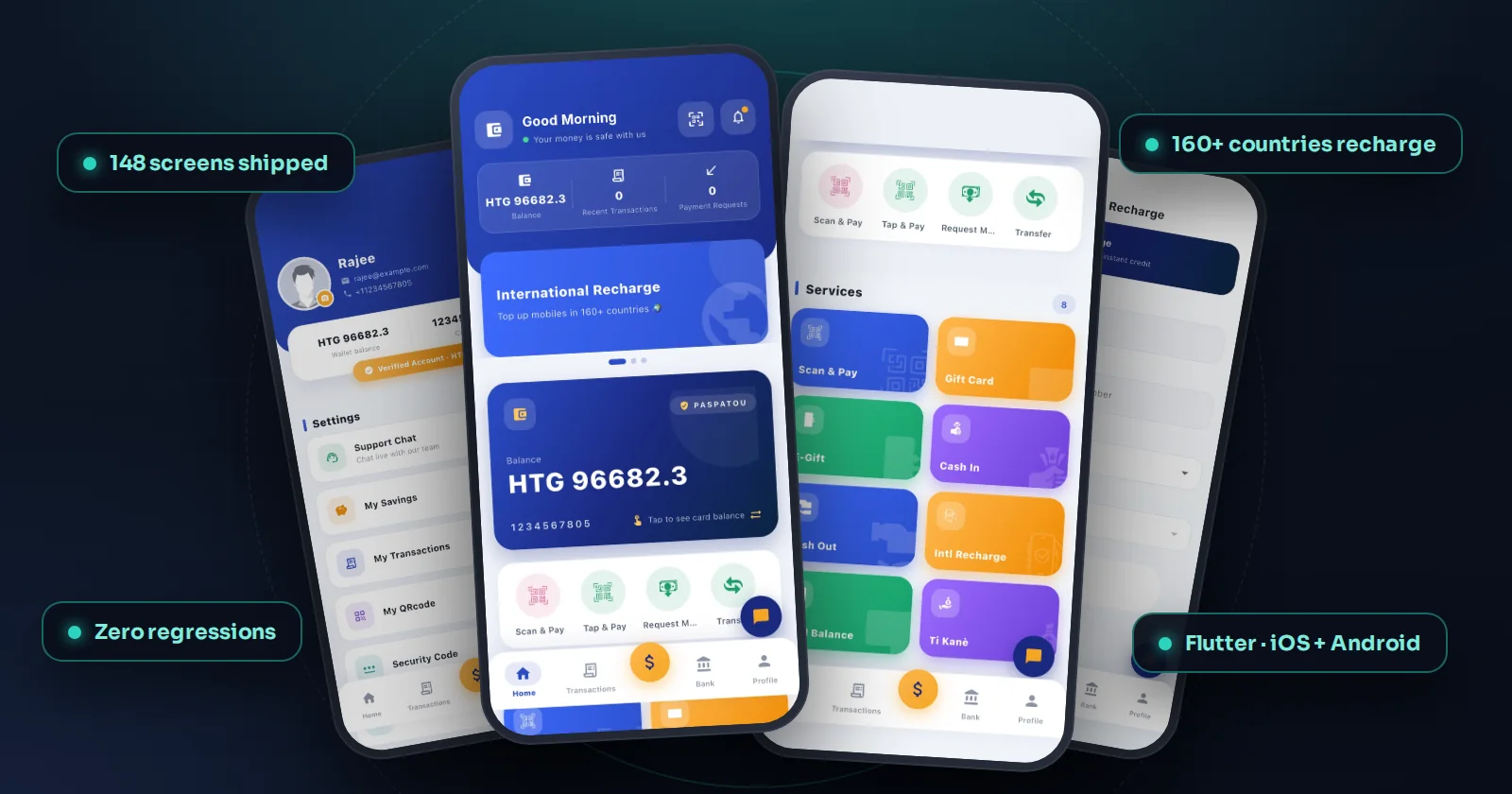
Real screens from the redesigned app, running on test data.
Paspatou's wallet worked, but its interface didn't match the trust a financial product needs. The catch: it was in production with active users and real money moving through it. A redesign meant touching wallet balances, transfers, transactions and package flows — where any regression is not a bug, it's a support crisis.
We built a complete premium design system — typography, color, components, motion — and applied it across the entire application: 148 screens delivered as clean, structured files with integration notes. Every flow was rebuilt visually and verified functionally, shipped in phases so users experienced an upgrade, not a disruption. The result: a fintech app that finally looks like it handles money — with zero regressions reported.
Four of the 148 screens. The same typography, colour and component rules run through all of them, which is what makes the app feel like one product instead of a collection of pages.
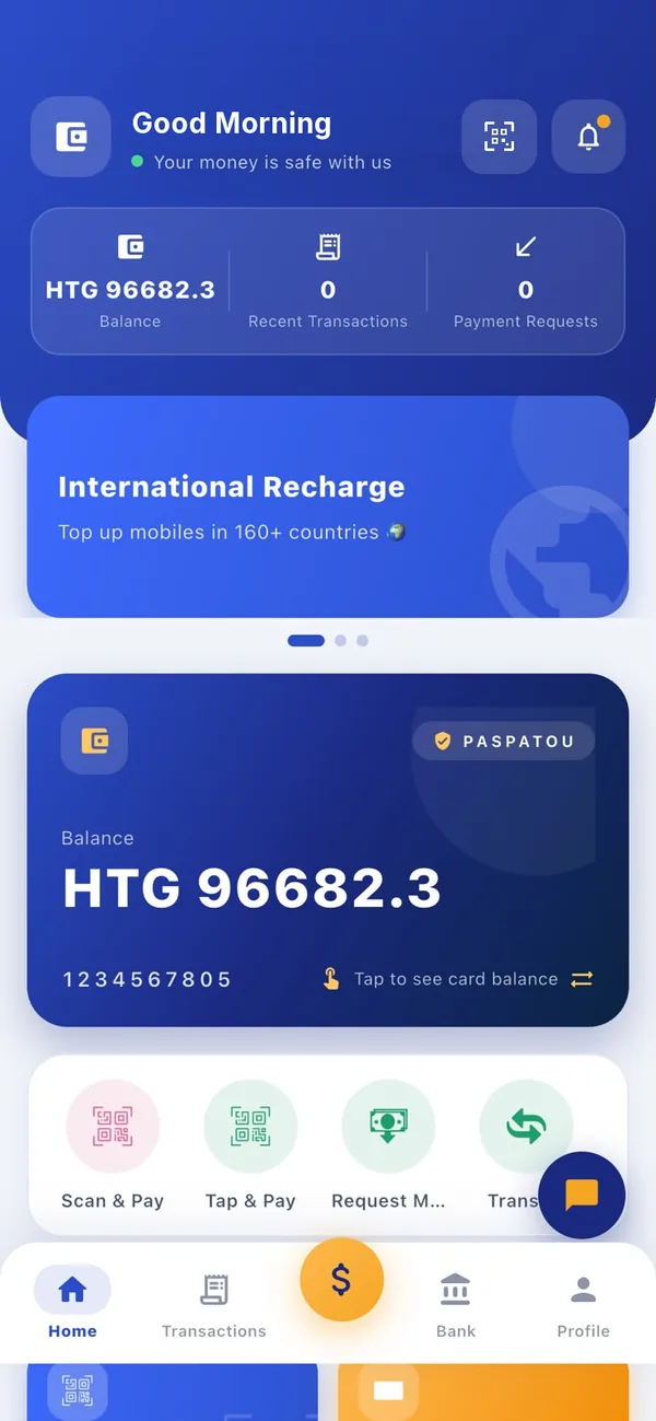
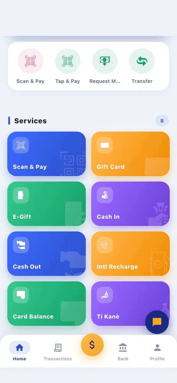
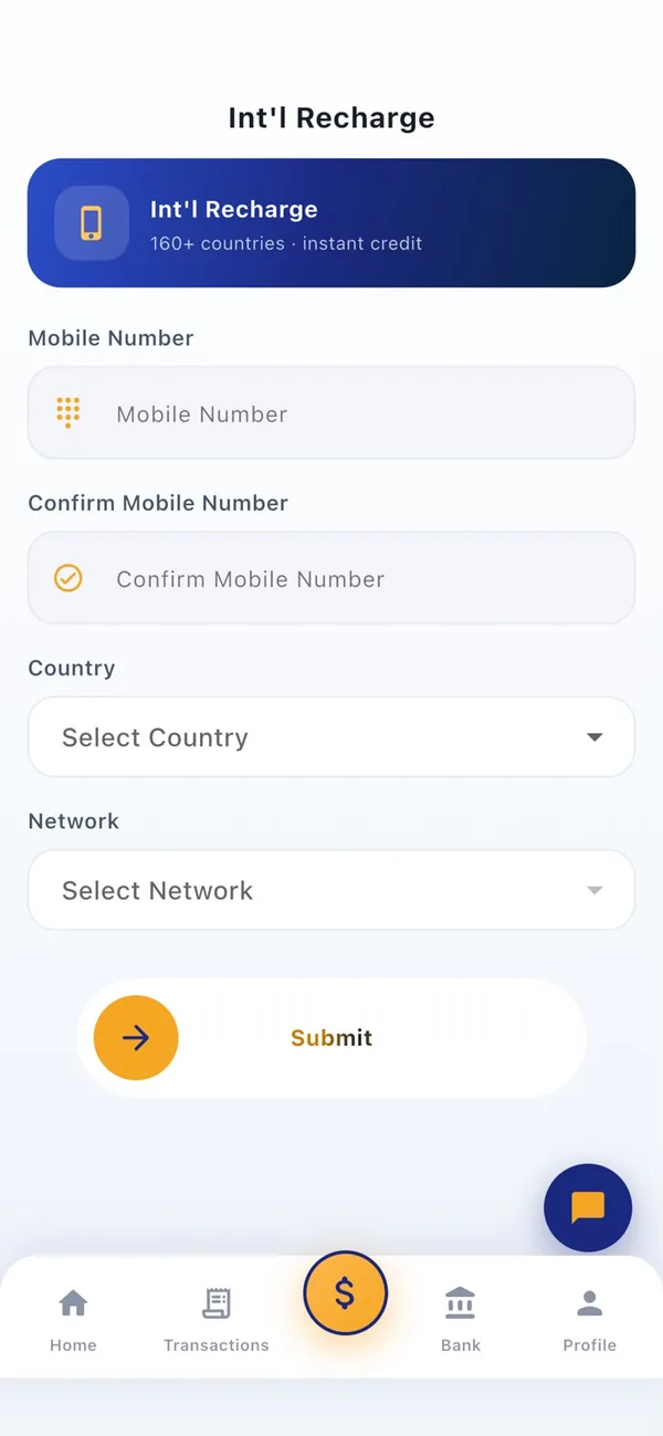
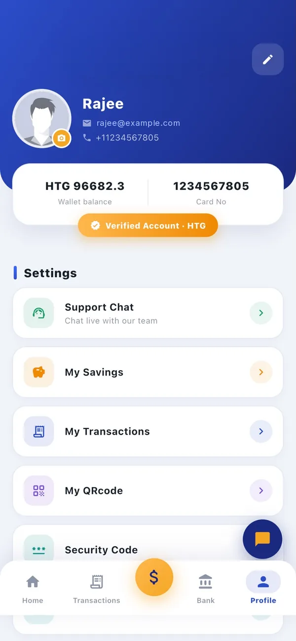
Redesigning an app that moves real money means the order of work matters as much as the design.
Typography, colour, components and motion were defined once, before a single screen was touched.
All 148 screens were redrawn on the new system and delivered as clean, structured files with integration notes.
Every flow, from balance and transfers to transactions and packages, was checked against live behaviour.
Released in phases, so users saw an upgrade and not a disruption. Zero regressions reported.
Free 30-minute consultation — honest scope, timeline and a fixed quote within 24 hours.